When decided to paint your home, choosing the right color palette for your space can be an exciting yet challenging decision. Whether you’re refreshing a single room or your entire home, the choice between bold and neutral colours can significantly influence the mood, functionality, and overall aesthetic. Here’s a guide to help you determine when to use each and why, so that when professional painters, like those at Larry’s Painting come in, your vision can come to life.
When to Use Bold Colours

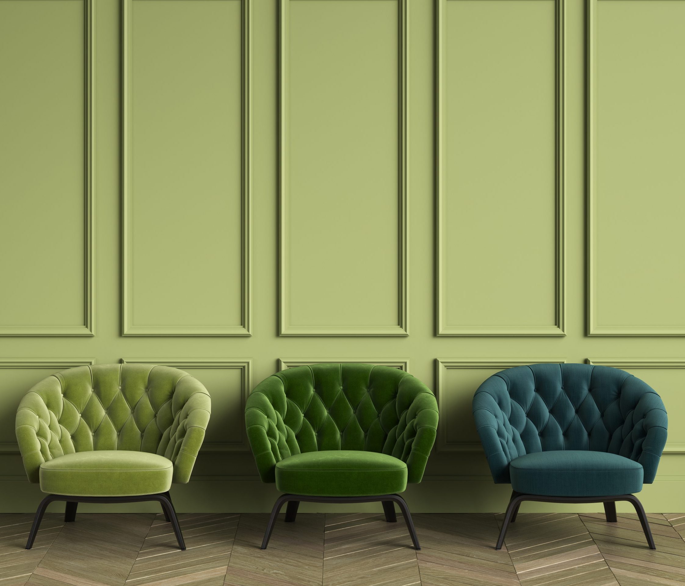
Bold colours, such as rich reds, deep blues, and vibrant yellows, can make a statement and inject personality into any space. They are perfect for creating focal points or highlighting architectural details. Here are some situations where bold colours shine:
- Creating Impactful Accent Walls: A single wall painted in a bold hue can become the centerpiece of a room, adding depth and drama without overwhelming the space.
- Defining Purpose in a Room: Bold colours work well in spaces designed for energy and creativity, such as home offices, playrooms, or dining areas. Bright tones can stimulate conversation and inspire productivity.
- Expressing Personal Style: If you have a favorite colour or want your home to reflect your unique personality, bold shades can make your space truly your own.
- Complementing Neutral Foundations: When paired with a neutral base, bold accents—in the form of painted furniture, trim, or cabinetry—can add just the right amount of visual interest.
When to Use Neutral Colours

Neutral tones, including whites, grays, beiges, and soft pastels, offer timeless appeal and versatility. They serve as the backdrop for many design styles, from modern to traditional. Here’s when neutrals are the perfect choice:
- Creating a Calm and Relaxing Atmosphere: Neutral palettes are ideal for bedrooms, living rooms, and bathrooms, where a sense of tranquility is key.
- Maximizing Light and Space: Light neutrals can make small or dimly lit rooms appear larger and brighter. They reflect natural light, enhancing the overall ambiance.
- Providing Flexibility for Decor Changes: Neutrals offer a blank canvas, allowing you to easily swap out furniture, artwork, or seasonal decor without worrying about clashing colours.
- Achieving a Sophisticated Look: A monochromatic neutral scheme can exude elegance and sophistication, perfect for formal dining rooms or minimalist interiors.
Balancing Bold and Neutral Colours

While bold and neutral colours each have their strengths, combining the two can result in a harmonious and visually appealing space. Here are some tips for striking the right balance:
- Start with a Neutral Base: Use neutral tones for walls, flooring, or large furniture pieces, then layer in bold colours through accessories, artwork, or smaller accent items.
- Consider the 60-30-10 Rule: This classic design principle suggests using 60% of a dominant colour (often a neutral), 30% of a secondary colour, and 10% of an accent colour (usually bold).
- Play with Textures and Patterns: Even within a neutral palette, textures and patterns can add depth and interest. Pair these with bold elements for a dynamic look.
- Use Color to Define Zones: In open-concept spaces, bold colours can delineate different areas, while neutrals maintain cohesion.
Final Thoughts
Whether you gravitate towards bold colours or prefer the timeless appeal of neutrals, the key is to choose a palette that aligns with your lifestyle and the purpose of your space. By understanding when and why to use each, you can create a home that is both functional and uniquely yours. Consulting professional painters, like Larry’s Painting, can ensure the job is done right and tailored to your preferences.
For Professional Painting Services:
www.larryspainting.ca
(416) 690-3890
sales@larryspainting.ca


